How to Add a Theme to Your Exhibition Booth Design!
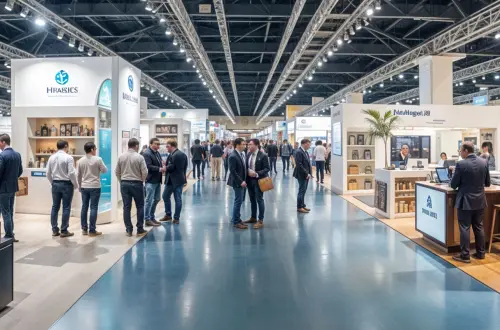
Take every chance available at a trade show to stand out! It’s the one rule to keep in mind, if you’re invested in incorporating trade events into your marketing strategy and want to justify the expenses that go into attending one. There’s much to consider and we have hit on a lot of aspects over the past few months, but where it all boils down to is your exhibition booth. The right booth design will either make or break a business trip, and considering how much you’ve spent on getting there, it’d better make an impact!
The vast majority of exhibitors will stick to the well-worn path. They’ll keep a basic booth design, hand out branded pens and completely fade into the background, because everyone else is doing the same. Also, it’s not uncommon for competitors to look like carbon copies of each other since they’ve taken the minimalist, professional approach to heart. What you need to do is:
Tell a story
There has to be a reason why you have decided to attend this particular trade fair on this particular year. Are you trying to introduce a new product? Are you looking to make waves with innovations? Do you seek to get to know prospective buyers? Yes, selling is a good enough reason, but there’s a more specific reason in that moment of time. Isolate this reason, and you have a story to work in your favor. The story is your running thread through every single thing you do for the event from social media to branded products to, yes, your exhibition stand. The story will also help you think of a theme that helps you stand out even better.
The theme has to be integrated into the story
Who you are as a brand, and what story you’re trying to tell at that exhibition are going to guide you to finding out the best possible theme. If your product is about excitement and revolutionizing a customer’s life, then finding a theme around adventure or action movies makes complete sense. If you make customer’s life easier and simpler, why not turn your booth into a piece of heaven in the exhibition centre. You understand what we’re saying. Your corporate brand, values and reason for exhibiting come together to create the best theme. Think outside the box. Nothing is off limits.
Use proper graphics and displays
Now that you have a vision for your theme, it’s time to commit to it! You can’t only think about a theme to how you’re going to pitch products or think that a few stickers or printouts will do the job. Not really. You have to base the entire booth design around the theme and this informs how it’s going to look as a shape and placement. How are visitors going to interact with the staff and the promotional materials? Do you need props? (Yes – the answer is always yes) How can you involve all the other senses? How do you incorporate displays? Think about every single element.
But don't forget to brand the design
One potential risk of letting your creativity run wild is to forget to insert the branding, which is the reason you’re there in the first place – to have people learn about your products and become your clients. Think of ways to bring in the color scheme of your logo and website into the booth, while keeping things interesting to the visitors. Do not be afraid to add your logos to every display and prop! It doesn’t need to be all blatant, and smart designers know how to incorporate branding into the booth without it being boring or too forceful.
The staff can make or break a good theme
You have put all this effort into creating an incredible fantasy that visually cues visitors to expect a completely unique experience when they come to talk to the people at the booth. Alas, disaster strikes when they meet with people dressed in the same boring business casual clothing and give you a standard sales pitch without play with the theme. Do not forget to bring in the staff to play along. If you’re doing a maritime theme, why not have the staff be sailor or pirates with the fitting costumes and accessories. We understand that you don’t want to go into full Halloween mode, but there are ways to be smart and modern with a few key accessories to make it work. We also would suggest you incorporate your theme into the sales pitch. A little wordplay goes a long way.
Now you’ve the knowledge and the tools to transform your exhibition stand from a pumpkin into a magical carriage. We completely understand that not many businesses have the budget to go full on out – that’s a game for bigger companies. If the budget comes to be the biggest restriction, there are ways to follow through on all these steps using little material. Usually, it comes down to ideas and whose ideas are thought out well. A smart theme with a good attention to detail will impress just as much as having holograms or animatronics.


